
Table of Contents
The subreddit ‘Data is Beautiful’ on Reddit stands as a testament to the fusion of art and science, where complex data is not merely presented but transformed into visual narratives that captivate and educate. This article delves into the essence of this online community, showcasing how data visualization transcends mere numbers to become a form of aesthetic expression. We explore the innovative projects that define the subreddit, the technical prowess behind these creations, and the educational value they provide, all while looking forward to the future of data visualization and its impact on community engagement.
Key Takeaways
- Reddit’s Data is Beautiful subreddit is a hub for data enthusiasts to share and appreciate the artistry in data visualization.
- Notable projects in the community often employ a range of programming languages and tools to transform raw data into engaging visuals.
- The aesthetics of data visualization play a critical role in how information is interpreted and understood by viewers.
- The subreddit serves as an educational platform, where complex data science concepts are made accessible through visual storytelling.
- User feedback and emerging trends in data presentation are shaping the future of data visualization on Reddit and beyond.
The Art of Data Visualization on Reddit’s Data is Beautiful

Understanding the Subreddit’s Purpose and Community
At its core, Reddit’s Data is Beautiful subreddit serves as a platform where aesthetics and information intersect. Enthusiasts, professionals, and newcomers alike gather here to appreciate and share complex data visualized in compelling and often beautiful ways. The community thrives on a shared passion for uncovering the stories hidden within data and presenting them in visually engaging formats.
The subreddit is not just about pretty pictures; it’s a place for learning and inspiration. Members are encouraged to critique, discuss, and improve upon the visualizations submitted, fostering a collaborative environment. Here’s a glimpse into the community’s composition:
- Active Members: Those who regularly contribute content and engage in discussions.
- Lurkers: Individuals who browse and appreciate the visualizations without active participation.
- Critics: Members who provide constructive feedback to help improve submissions.
- Learners: People looking to enhance their data visualization skills.
The beauty of data is not just in its visual representation, but in the insights it can provide and the questions it can provoke.
The subreddit also acts as a beacon for those seeking to enhance their understanding of data analysis and visualization tools. With a focus on tools like Python and R programming languages, it aligns with resources like the SethT website, which offers content on web development, business intelligence, and data analysis.
Exploring Notable Projects and Visualizations
The subreddit r/DataIsBeautiful is a treasure trove of creative data visualization techniques that transform raw data into compelling visual stories. Among the myriad of projects, a few stand out for their innovative approach to presenting information.
- Lumen Visual Flow by Greg Kamprath offers a visual tool for managing event flow, from quoting to setup.
- Snake by Gr\u00e9goire Yves G\u00e9rard Briand turns the classic game into a data-driven experience.
- cinefile by Ian Herrera creates a persistent, customizable list of top movies, showcasing user preferences in an engaging format.
These projects not only display data but also invite interaction, allowing users to explore and manipulate the visualizations. > The beauty of these works lies in their ability to make complex data not just understandable, but also visually appealing and interactive. This intersection of aesthetics and analytics is what makes the subreddit a hub for data enthusiasts and artists alike.
The Impact of Aesthetics on Data Interpretation
The aesthetic appeal of data visualizations can significantly influence how information is perceived and understood. A well-designed chart or graph not only conveys data more effectively but also engages the viewer, encouraging deeper analysis and interpretation. The subreddit’s community often discusses the importance of aesthetics in making complex data more relatable and digestible.
- Clarity in design ensures that the message is not lost amidst visual noise.
- Color schemes and typography play a crucial role in guiding the viewer’s attention.
- The layout and scalability of visualizations affect their usability across different devices.
Aesthetics in data visualization are not just about beauty; they are about creating a clear path to understanding.
Projects like the ‘Minimax Project’ by Nicholas Amescua, which presents the perfect tic tac toe strategy, exemplify how a clean and intuitive design can make even game strategies accessible. Similarly, ‘CSV to Plotly’ by Nicholas Brown transforms simple CSV files into interactive plots, showcasing how data can be both informative and visually compelling.
Creative Showcases: Highlighting Innovative Submissions
Interactive Gaming Statistics: From Epic Games to Snake Eater
The subreddit Data is Beautiful serves as a platform where gaming enthusiasts and data analysts converge to share their insights through visualizations. Interactive gaming statistics have become a staple, showcasing everything from player behavior to game popularity trends. For instance, visualizations of Epic Games’ player data reveal patterns in gaming sessions, while analyses of classic games like Snake Eater provide a nostalgic look at historical gaming data.
One notable submission detailed the evolution of the Snake game, from its origins on the Nokia 1100 to modern AI-enhanced versions. This visualization not only depicted the game’s development but also highlighted the technological advancements in gaming over the years.
The beauty of data visualization lies in its ability to transform raw numbers into a story that resonates with the audience, making complex information digestible and engaging.
The table below summarizes some of the innovative gaming-related projects submitted to the subreddit, reflecting the diverse applications of data visualization within the gaming industry:
| Project Title | Creator | Game Type | Technology Used |
|---|---|---|---|
| ARCADE FIGHT CLUB | Artin Fakhrianpour | 2D Fighting | – |
| snake game | Artin Maleki | Classic Arcade | Nokia 1100 |
| NBA App | Artis Lazdenieks | Sports Statistics | – |
| SHARPSQL | Artjoms Plečkens | Database Management | NPGSQL |
These projects not only entertain but also serve as educational tools, demonstrating the power of data in understanding and improving the gaming experience.
Visualizing Movie Preferences with cinefile and Movies For You
The intersection of data visualization and film enthusiasm is exemplified by projects like cinefile and Movies For You. These applications not only cater to movie buffs but also showcase the power of data in personalizing entertainment experiences. cinefile, developed by Ian Herrera, is a full-stack React application that allows users to curate a list of the top 100 movies, as recognized by the AFI, and maintain that list across sessions. On the other hand, Movies For You, created by Ian Lieberman, offers a more interactive approach. Users express their preferences through likes and dislikes, and the program suggests similar movies, learning from their choices to refine its recommendations.
The beauty of these visualizations lies in their ability to transform subjective tastes into objective data, creating a unique user experience that is both informative and engaging.
These projects demonstrate the potential of data-driven applications to enhance our interaction with media. By analyzing user preferences and providing tailored suggestions, they turn the act of choosing a movie into a personalized journey. Below is a summary of the features that make these applications stand out:
- cinefile: Customizable top 100 movies list, persistent user sessions
- Movies For You: Interactive recommendation system based on user feedback
Both applications exemplify the subreddit’s ethos of making data not just comprehensible, but also aesthetically pleasing and functionally relevant.
Analyzing Social Media Trends with Twitter Insights
The 2024 Guide to Twitter Analytics provides a comprehensive look at the essential tools and tips for understanding social media trends. Twitter analytics is a crucial component for anyone looking to measure the impact of their social media presence. It encompasses a variety of metrics that offer insights into follower count, engagement, impressions, retweets, and more.
One standout project in this realm is the ‘Twitter Insights’ app developed by Carlos Poles. This visualization tool takes the complex data from Twitter and transforms it into an accessible and informative display. Users can track their social media performance over time and identify patterns that could inform future strategies.
The ability to distill vast amounts of data into meaningful visualizations is what sets apart effective social media analytics tools.
Understanding these analytics can be broken down into a few key areas:
- Follower Count: A measure of your audience size.
- Engagement: Interactions such as likes, comments, and shares.
- Impressions: The number of times your content is displayed.
- Retweets: The spread of your content through user sharing.
Technical Insights: Behind the Scenes of Data Art

The Role of Programming Languages in Data Visualization
The choice of programming language can significantly influence the effectiveness and aesthetics of data visualizations. Python and R are among the most popular languages in this domain, offering extensive libraries and frameworks that simplify the creation of complex visualizations. For instance, Python’s Matplotlib and Seaborn, as well as R’s ggplot2, provide users with powerful tools to craft detailed and interactive graphics.
The following table outlines some common programming languages and their associated libraries used in data visualization:
| Language | Libraries/Frameworks |
|---|---|
| Python | Matplotlib, Seaborn, Plotly |
| R | ggplot2, Shiny |
| JavaScript | D3.js, Chart.js |
| Julia | Gadfly, Plots |
The synergy between a language’s capabilities and the designer’s intent is crucial in conveying the right message through data. A well-chosen language not only makes the visualization process more efficient but also enhances the final product’s ability to tell a compelling story.
Understanding the nuances of each language and its libraries is essential for data artists who wish to push the boundaries of what can be visually communicated. The subreddit’s community often discusses the merits and challenges of various programming tools, fostering a collaborative environment for learning and innovation.
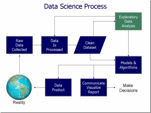
From SQL Databases to Heatmaps: The Process of Data Transformation
The journey from raw data to a compelling heatmap involves a series of meticulous steps, each critical to the final visualization. The transformation process often begins with data extraction from SQL databases, a staple in data storage and management. This data, while rich in information, is not immediately suitable for visual representation.
To prepare the data for visualization, it must be cleaned and structured. This involves handling missing data, normalizing values, and categorizing information. For instance, the non_heart.dataset might require imputing missing values using statistical methods like mean or median before it can be visualized effectively.
Once the data is primed, the actual transformation takes place. This is where programming languages like R and Python come into play, each offering robust libraries for data manipulation and visualization. The choice between R and Python can be influenced by factors such as the nature of the dataset, the complexity of the analysis, and the visual goals of the project.
The final step is the creation of the heatmap itself, which not only reveals patterns and trends but also serves as a bridge between data and human cognition.
The table below illustrates a simplified version of the data transformation process:
| Step | Description |
|---|---|
| 1 | Extract data from SQL databases |
| 2 | Clean and structure the data |
| 3 | Choose the appropriate programming language |
| 4 | Generate the heatmap |
By understanding and mastering these steps, creators on Reddit’s Data is Beautiful subreddit turn complex datasets into stunning visual narratives.
Leveraging Libraries and Tools for Enhanced Visuals
In the realm of data visualization, the use of specialized libraries and tools is a game-changer for creators. The right toolkit can transform raw data into captivating visual stories, making complex information digestible and engaging. For instance, JavaScript libraries like D3.js and Toast UI Chart have become staples for interactive and dynamic presentations.
Python, with its robust libraries such as Pandas, is another heavyweight in the data visualization arena. These tools not only simplify the process of crafting visuals but also offer a level of customization that caters to the unique needs of each dataset.
The synergy between data and design is at the heart of creating visuals that are not only informative but also aesthetically pleasing.
To illustrate the diversity of available tools, here’s a snapshot of some of the best data visualization libraries as highlighted in a recent blog post:
- JavaScript Data Visualization Libraries
- Toast UI Chart
- D3.js
- Python Data Visualization Libraries
- Pandas
These libraries empower users to produce visuals that are not just functional but also beautiful, ensuring that the message within the data doesn’t just inform, but resonates.
Educational Aspects of Data is Beautiful

Learning Through Visualization: Algorithm Visualizer and Sorting Algorithms
The realm of data visualization extends into the educational sphere, where tools like Algorithm Visualizer and various sorting algorithm visualizations play a pivotal role in demystifying complex concepts. These visualizers transform abstract algorithms into tangible animations, allowing users to grasp the intricacies of sorting methods through direct observation.
One such example is SortView, a platform that enables learners to interact with and understand the mechanics behind sorting algorithms. By providing a hands-on experience, SortView and similar projects foster a deeper comprehension of algorithmic processes.
The beauty of these visual tools lies in their ability to convert theoretical knowledge into practical understanding.
Here’s a brief overview of some popular sorting algorithms and their characteristics:
- Quick Sort: Efficient for large datasets, employs a divide-and-conquer approach.
- Merge Sort: Stable and consistent, works well with linked lists.
- Heap Sort: Utilizes a binary heap data structure, good for in-place sorting.
- Bubble Sort: Simple but less efficient, often used for educational purposes.
Data Science for the Masses: Making Complex Concepts Accessible
The subreddit Data is Beautiful serves as a bridge between complex data science concepts and the general public. Visualizations act as a translator, converting intricate datasets into understandable and engaging graphics. This democratization of data science is not just about aesthetics; it’s about education and empowerment.
By simplifying the presentation of data, the subreddit encourages users to explore and interact with information that might otherwise be daunting.
For those new to the field, the subreddit offers a variety of resources to get started. Here’s a brief overview:
- Courses: Introductory courses like CS50x and CS50 Python provide a foundation in computer science and data handling.
- Projects: Users share projects like sentiment analysis tools and game analytics, showcasing practical applications of data science.
- Tools: Submissions often include the tools used, such as Python for analysis or D3.js for visualization, offering insights into the technical process.
The community’s approach to making data science accessible has a profound impact. It not only educates but also inspires new ways of thinking about data and its role in our lives.
The Subreddit as a Platform for Knowledge Exchange and Collaboration
Reddit’s Data is Beautiful subreddit serves as a vibrant hub for individuals passionate about data visualization and aesthetics. It’s a place where novices and experts alike can share their work, seek feedback, and engage in discussions that foster learning and improvement. The community’s collaborative spirit is evident in the way members support each other through constructive criticism and advice.
The subreddit is not just about showcasing finished projects; it’s also a breeding ground for new ideas and methodologies. Here, users can find inspiration from a variety of topics, including data science, Python, R, and discrete probability distribution. The platform encourages experimentation with different tools and techniques, such as SQL vs NoSQL databases or the random forest algorithm, which can lead to innovative approaches to data storytelling.
The exchange of knowledge on this subreddit goes beyond technical aspects, touching upon the practical side of data science, like making money with data science or analyzing Twitter sentiment. It’s a testament to the subreddit’s role in democratizing data science education and making it more accessible to a wider audience.
As a testament to its educational value, here’s a snapshot of the diverse range of projects and discussions you might encounter on the subreddit:
- Website covers topics on data science
- Interactive discussions on Python and R programming
- Insights into Twitter sentiment analysis
- Explorations of discrete probability distribution
- Debates on SQL vs NoSQL
- Strategies for implementing the random forest algorithm
- Tips for making money with data science
The Future of Data Visualization and Community Engagement

Emerging Trends in Data Presentation and Aesthetics
As we delve into the future of data visualization, we witness a continuous evolution in the way information is presented. Dark modes and minimalist designs are becoming increasingly popular, catering to both aesthetic preferences and potential health benefits. These trends not only enhance the visual appeal but also improve the readability and user experience of data visualizations.
Emerging technologies and creative approaches are pushing the boundaries of traditional data presentation. For instance, the use of augmented reality (AR) and virtual reality (VR) in visualizing data offers immersive experiences that were once unimaginable. Here’s a glimpse into the trends that are shaping the future:
- Minimalist and clean designs
- Dark mode for better contrast and reduced eye strain
- Immersive experiences with AR and VR
- Interactive elements that engage users
The integration of aesthetics and functionality is paramount in creating visualizations that are not only informative but also captivating. As we look ahead, the convergence of data science and design principles promises to bring forth innovative and intuitive ways to interpret complex datasets.
The Role of User Feedback in Shaping Future Visualizations
In the realm of data visualization, user feedback is a pivotal force that drives innovation and improvement. Feedback loops enable creators to refine their work, ensuring that it not only conveys the intended message but also resonates with the audience. This iterative process is crucial for the evolution of visualizations on platforms like Reddit’s Data is Beautiful.
The community’s input often highlights areas for enhancement, from the clarity of the data presented to the intuitiveness of interactive elements.
Creators leverage various forms of feedback, including comments, upvotes, and direct messages, to gauge the effectiveness of their visualizations. This information is then used to make data-driven decisions on design adjustments and content focus. Below is a list of common feedback types and their potential impact:
- Comments: Provide qualitative insights and suggestions for improvement.
- Upvotes/Downvotes: Indicate general approval or disapproval, guiding the popularity and visibility of submissions.
- Direct Messages: Offer more personalized and detailed critiques or praise.
The subreddit’s culture of constructive criticism fosters a collaborative environment where both novice and expert visualizers can thrive. As user feedback continues to shape the future of data visualization, we can expect to see even more innovative and engaging ways to present complex data.
Expanding the Reach: From Reddit to Broader Audiences
The subreddit’s influence extends beyond its own community, as visualizations from Data is Beautiful find their way into academic papers, news articles, and even corporate boardrooms. The transition from Reddit to mainstream media signifies a growing appreciation for data storytelling.
- Academic papers reference innovative visualizations as illustrative examples.
- News outlets incorporate user-generated content to enrich reporting.
- Corporate presentations leverage visual data to inform decision-making.
The democratization of data through visual storytelling empowers individuals to engage with complex information in a meaningful way.
As the subreddit’s content becomes more accessible, it’s crucial to ensure that the visualizations are not only aesthetically pleasing but also inclusive. Following guidelines like those outlined in the article ‘How to Create Accessible Infographics And Data Visualizations’ can help creators reach a wider audience. These include using high-contrast colors, providing alt text, and labeling visuals clearly.
Embracing the Art of Data Visualization
In conclusion, the ‘Data is Beautiful’ subreddit on Reddit stands as a testament to the power of data visualization in transforming complex datasets into compelling visual narratives. From interactive heatmaps to dynamic graphs, the projects discussed exemplify the creativity and technical skill that go into making information aesthetically pleasing and accessible. Whether it’s tracking fitness progress, managing powder coating formulas, or analyzing stock trends, these visualizations not only serve practical purposes but also engage and educate their audience. As we continue to generate vast amounts of data, the importance of such visual storytelling will only grow, encouraging us to see and understand the world through the lens of data-driven artistry.
Frequently Asked Questions
What is Reddit’s Data is Beautiful subreddit about?
Data is Beautiful is a subreddit community on Reddit dedicated to visualizing data in aesthetically pleasing and informative ways. It’s a place where enthusiasts and professionals share projects that transform complex data into visualizations that are easy to understand and visually engaging.
Can anyone submit visualizations to the Data is Beautiful subreddit?
Yes, anyone with a Reddit account can submit their data visualizations to the Data is Beautiful subreddit. However, submissions must adhere to the community’s guidelines and standards for quality and relevance.
What are some of the most innovative projects featured on Data is Beautiful?
Projects range from interactive gaming statistics like ‘Epic Games’ by Antonio Luis to social media trend analyses such as ‘Twitter Insights’ by Carlos Poles. Innovative visualizations like the ‘Bicycle Data Visualization Website’ by Antonio de Jesus Juan Fernández showcase the creative use of data from SQL databases.
What tools and programming languages are commonly used for creating data visualizations?
Popular programming languages for data visualization include Python, JavaScript, and R. Libraries and tools such as D3.js, Plotly, and Streamlit are also widely used to create interactive and dynamic visuals.
How does the Data is Beautiful subreddit contribute to education and learning?
The subreddit serves as a platform for knowledge exchange and collaboration. It allows individuals to learn through visual examples like ‘Algorithm Visualizer’ by Kamal Kandpal and promotes the accessibility of complex data science concepts to a broader audience.
What future trends in data visualization can we expect to see on Data is Beautiful?
Emerging trends may include more interactive and immersive experiences, the integration of machine learning for predictive visualizations, and a greater focus on mobile-friendly designs. User feedback will continue to play a significant role in shaping future visualizations.