Table of Contents
In today’s data-driven world, the ability to accurately calculate, analyze, and present data is crucial for success across various fields. ‘Mastering Your Data: A Comprehensive Guide to Using a Data Calculator’ is an essential read for anyone looking to enhance their data management skills. From understanding the importance of data quality to effectively communicating your findings, this guide provides a detailed roadmap for navigating the complex landscape of data. Here are some key takeaways to help you get started on your journey to data mastery.
Key Takeaways
- Good data quality is foundational for reliable analysis, and master data governance is key to maintaining this quality.
- Effective data collection and management strategies are essential for organizing and leveraging data to its full potential.
- Mastering data calculators and analytical tools can significantly enhance the speed and accuracy of your data analysis.
- Creating compelling data reports requires a synthesis of findings and the ability to choose and use visual representations wisely.
- Continuous improvement in data quality and management practices can lead to significant business value and trust in data.
Laying the Foundation: Understanding Data Quality

Defining Data Quality and Its Importance
At the core of any data-driven decision-making process is the concept of data quality. It is the measure of a data set’s condition based on critical factors such as accuracy, completeness, consistency, reliability, and validity. High data quality ensures that the information is trustworthy and can be effectively utilized for various purposes, from strategic decision-making to operational analysis.
Understanding the dimensions of data quality is essential. Many organizations adopt a Data Quality Assessment Framework (DQAF) to evaluate their data. The framework typically includes the following dimensions:
- Completeness
- Timeliness
- Validity
- Integrity
- Uniqueness
- Consistency
It is crucial to recognize that data quality is context-dependent. What may be considered high quality in one application could be inadequate in another. This is why it’s important to assess data quality with a clear understanding of its intended use.
Low data quality can lead to errors, inconsistencies, or gaps in data, which in turn can result in incorrect conclusions or unreliable outcomes. To mitigate these risks, it is imperative to establish a robust framework for assessing and maintaining the quality of data across its lifecycle.
Establishing Metrics for Data Quality Assessment
To ensure that data serves its intended purpose effectively, it’s crucial to establish clear metrics for data quality assessment. Understanding the context in which data will be used is fundamental to defining these metrics. The Data Quality Assessment Framework (DQAF) outlines six dimensions to consider: Completeness, Timeliness, Validity, Integrity, Uniqueness, and Consistency. These dimensions help in creating a standardized approach to evaluating data quality.
By establishing metrics, organizations can create a benchmark for what constitutes good quality data, allowing for consistent quality checks and improvements over time.
It’s important to involve subject matter experts from various business domains when assessing data against these metrics. Their insights ensure that the data quality is aligned with the specific needs of different areas within the organization. Here’s a succinct table outlining the key dimensions of the DQAF:
| Dimension | Description |
|---|---|
| Completeness | Ensures all required data is present. |
| Timeliness | Data is up-to-date and available when needed. |
| Validity | Data is accurate and conforms to the required format. |
| Integrity | Data is consistent and reliable across systems. |
| Uniqueness | Each data entry is distinct and non-redundant. |
| Consistency | Data is consistent across different datasets. |
Recognizing the signs that data quality has room for improvement is also a key step in the process. Issues such as data being swept under the rug or inconsistencies across datasets are indicators that the established metrics need to be revisited and refined.
The Role of Master Data Governance in Data Quality
Master data governance is the linchpin in the quest for high-quality data. It is the framework that ensures data consistency, accuracy, and security across an organization. By implementing robust master data governance, businesses can trust their data to make informed decisions.
Effective governance involves a set of rules and policies that guide data collection, storage, and usage. It is a proactive approach that prevents data issues before they arise. The following table outlines the key components of a strong master data governance framework:
| Component | Description |
|---|---|
| Data Standards | Ensuring uniform data definitions and formats |
| Data Stewardship | Assigning responsibility for data accuracy |
| Data Policies | Establishing usage guidelines and permissions |
| Data Quality Tools | Utilizing software to monitor and cleanse data |
Master data governance transforms reactive data management into a proactive strategy that empowers businesses.
The journey to excellent data governance requires commitment and a clear understanding of the organization’s data landscape. It is not just about the tools and processes, but also about cultivating a culture where data is valued and properly managed. As highlighted by the SethT website, topics like data warehousing and data collection strategies are crucial for maintaining data quality.
Navigating the Data Landscape: Strategies for Data Collection and Management

Identifying and Collecting Relevant Data
The process of identifying and collecting relevant data is a critical step in the journey of data mastery. It involves a keen eye for detail and the ability to distinguish between what is essential and what can be disregarded. Amidst the vast sea of information, it’s crucial to focus on data that aligns with specific objectives. This not only streamlines the subsequent stages of analysis but also ensures that the insights derived are actionable and pertinent.
To effectively collect and organize data, consider the following steps:
- Define clear objectives for data collection.
- Identify key data sources, such as the SethT website, which offers content on web development, business intelligence, and data analysis.
- Utilize tools and techniques that aid in filtering and sorting data.
- Pay attention to details like units and timeframes, which can significantly impact data interpretation.
In the realm of data collection, precision is paramount. Ensuring that each data point is relevant and accurately captured sets the stage for meaningful analysis and informed decision-making.
Organizing Data with Effective Tools and Techniques
In the digital age, the organization of data is paramount to extracting meaningful insights. Effective data organization not only streamlines the analysis process but also ensures that data remains accessible and secure. To achieve this, several tools and techniques stand out as particularly effective.
- Data Catalogs: Central repositories that store metadata, allowing for easier data discovery and management.
- Master Data Management (MDM) Solutions: Systems that ensure the uniformity, accuracy, and stewardship of an enterprise’s critical data.
- Data Modelling Tools: Software that helps in visualizing and defining data relationships and structures.
By employing these tools, organizations can significantly reduce the time spent on data management tasks, freeing up resources for more strategic activities.
It’s crucial to not only choose the right tools but also to implement them in a way that aligns with the organization’s data governance policies. This ensures that data remains consistent, compliant, and ready for analysis. Remember, the goal is to turn data into a strategic asset, and organizing it effectively is the first step in that journey.
Implementing Strong Master Data Governance
Master data governance is the cornerstone of high-quality data management. It ensures consistency, accuracy, and accountability across all data assets. By establishing clear policies and procedures, organizations can maintain control over their master data, which in turn supports reliable data analysis and decision-making.
Effective master data governance involves several key components:
- Leadership and Commitment: Senior management must endorse and support governance initiatives.
- Policies and Standards: Clear guidelines for data handling must be established.
- Data Stewardship: Assigning responsibility to individuals or teams for data quality and maintenance.
- Technology and Tools: Implementing the right software to support governance processes.
By proactively managing master data, organizations can prevent the costly consequences of poor data quality and ensure that their data is a powerful business enabler.
Remember, master data governance is not just a technical challenge; it’s a business imperative that requires ongoing attention and adaptation. As the SethT website highlights, topics like Big Data and data enrichment are crucial in today’s data-driven landscape. Master data governance paves the way for leveraging these advanced data topics effectively.
Crunching the Numbers: Techniques for Effective Data Analysis

Mastering Calculation Tools and Prompts
In the realm of data analysis, the ability to swiftly and accurately perform calculations is paramount. Mastering the use of calculation tools and prompts is essential for any data professional. A common tool is the draggable on-screen calculator, which facilitates real-time math calculations. However, users often encounter challenges with this tool, such as laggy interfaces and buggy functionality, which can hinder the analysis process under time constraints.
To overcome these obstacles, it’s crucial to practice calculations to enhance both speed and accuracy. Familiarity with the tool’s features, such as the drag-and-drop function, can significantly improve efficiency. Here’s a quick guide to navigating common issues:
- Practice with the calculator to become adept at its functions.
- Be prepared to troubleshoot or find workarounds for technical issues.
- Focus on the objectives to filter relevant information during the analysis.
While the calculator is a critical component, it’s the analyst’s ability to devise the correct formulas and apply them effectively that truly drives the success of data calculations.
Troubleshooting Common Data Analysis Issues
When diving into data analysis, encountering issues is almost a given. Deciphering error messages is a crucial skill, as they often provide the first clue to resolving a problem. For instance, an ‘Internal server error’ typically indicates a temporary issue, while ‘Too many requests’ suggests you’ve exceeded your request quota. Understanding these messages can save time and prevent unnecessary frustration.
Effective troubleshooting requires a systematic approach. Here’s a simple guide to follow:
- Identify the error message or issue.
- Consult documentation or online resources for potential solutions.
- Isolate the problem by testing different parts of your analysis process.
- Apply the suggested fixes and verify if the issue is resolved.
Remember, patience and persistence are key. Not all solutions will be immediately apparent, and some issues may require multiple attempts to resolve.
In addition to technical problems, data quality can significantly impact analysis outcomes. Ensuring data meets standards of completeness, timeliness, validity, integrity, uniqueness, and consistency is paramount. A Data Quality Assessment Framework (DQAF) can be instrumental in evaluating these aspects:
Enhancing Speed and Accuracy in Data Calculations
In the realm of data analysis, the ability to perform calculations with both speed and accuracy is paramount. Mastering the use of data calculators is essential for analysts to deliver timely and reliable results. Here are some tips to enhance your calculation skills:
- Practice regularly to increase your calculation speed without sacrificing accuracy.
- Familiarize yourself with common formulas and shortcuts within your tools.
- Develop a systematic approach to troubleshooting technical issues that may arise.
When faced with complex calculations, it’s crucial to maintain a clear and organized workflow. This ensures that you can quickly identify and correct errors, leading to more accurate outcomes.
Remember, the goal is not just to complete calculations swiftly but to ensure that they are correct. A single error can lead to significant misinterpretations of data. Therefore, it’s important to:
- Double-check your work, especially when working under time constraints.
- Use the drag-and-drop feature in your tools to organize data efficiently.
- Keep a checklist of common calculation pitfalls to avoid them in future analyses.
By implementing these strategies, you can significantly enhance the speed and accuracy of your data calculations, paving the way for more insightful and impactful data analysis.
Presenting Your Findings: Crafting a Compelling Data Report

Synthesizing Data into Coherent Reports
The process of synthesizing data into coherent reports is a critical step in communicating the insights gained from analysis. It involves the distillation of complex information into a format that is both accessible and meaningful to the intended audience. To achieve this, one must be adept at selecting the most effective visual data representations and ensuring clarity in written summaries.
The essence of a well-synthesized report lies in its ability to convey accurate conclusions from data, highlighting the relationships and trends that are most significant.
Here is an example of how quantitative data might be presented in a report:
| Metric | Q1 | Q2 | Q3 | Q4 |
|---|---|---|---|---|
| Revenue | $20M | $22M | $25M | $30M |
| Expenses | $10M | $12M | $15M | $18M |
| Profit | $10M | $10M | $10M | $12M |
In addition to visual tools, the textual part of the report should not be overlooked. It requires a clear and concise summary of findings, ensuring that the main conclusions drawn from the analysis are communicated effectively. This is where the ability to synthesize information becomes paramount, as it allows one to consider specific concepts together and understand how they relate to one another.
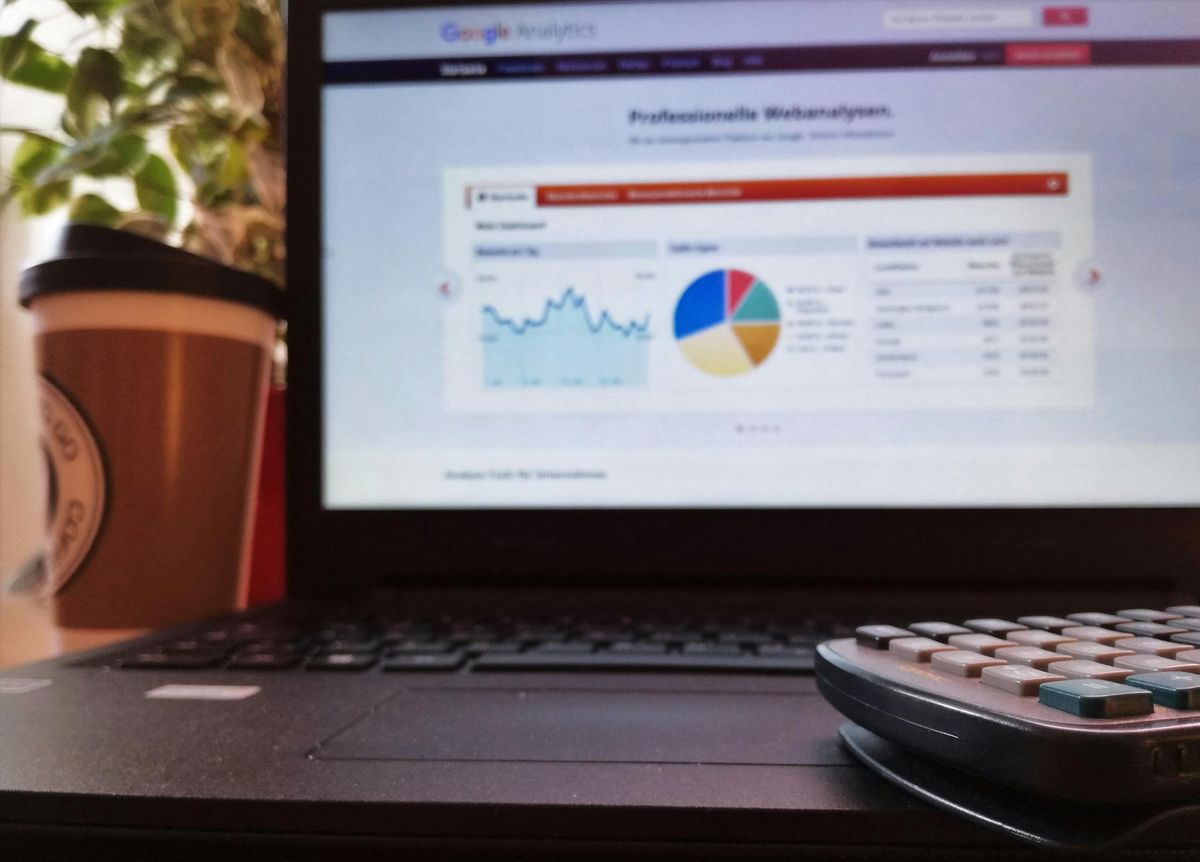
Choosing the Right Visual Data Representations
Selecting the most effective visual representation for your data is crucial for conveying the insights clearly and powerfully. The right chart or graph can illuminate relationships and trends, making it easier for the reader to understand the key messages.
When considering which type of chart to use, reflect on the nature of your data and the story you want to tell. Here’s a simple guide to help you decide:
- Use line charts for continuous data to show trends over time.
- Opt for bar charts to compare quantities among different groups.
- Choose pie charts when you want to illustrate proportions within a whole.
Remember, the goal is to enhance the reader’s comprehension, not to complicate it. The best visual representation is one that makes the data accessible and engaging.
In practice, you might encounter data like sales figures for different regions over several quarters. A table can succinctly present this structured, quantitative information:
| Quarter | North | South | East | West |
|---|---|---|---|---|
| Q1 | $5M | $3M | $4M | $2M |
| Q2 | $6M | $3.5M | $4.5M | $2.5M |
| Q3 | $7M | $4M | $5M | $3M |
This table format allows for quick comparisons and trend analysis across regions and time periods.
Ensuring Clarity and Precision in Data Communication
In the realm of data communication, clarity and precision are paramount. When presenting data findings, it’s crucial to articulate the insights in a manner that is easily understood and free from ambiguity. This involves not only the language used but also the structure and format of the presented data.
For instance, consider the following table summarizing customer feedback on data tools:
| Tool | Satisfaction Rating | User Comments |
|---|---|---|
| A | 4.5 | User-friendly |
| B | 3.8 | Needs updates |
| C | 4.2 | Versatile |
This table provides a clear, at-a-glance understanding of the feedback, enabling quick comparisons and informed decisions.
Ensuring that every piece of data communicated is accurate and effectively conveys the intended message is not just a best practice; it’s a responsibility. Misinterpretation can lead to significant consequences, affecting decisions and strategies.
It’s also essential to be mindful of the volume of data presented. Overwhelming an audience with too much information can be as detrimental as providing too little. Striking the right balance is key to maintaining engagement and ensuring that the critical points are not lost in a sea of data.
Elevating Data Quality: From Guardian to Guiding Light

Conducting Data Profiling Exercises for Quality Improvement
Data profiling is a critical step in enhancing data quality. It involves a thorough examination of existing data to identify inconsistencies, duplicates, and outliers. Engaging subject matter experts from various business domains is essential to ensure that data quality issues are evaluated within the correct business context. This collaborative approach leads to a more accurate and comprehensive understanding of data quality challenges.
The process typically includes the use of specialized tools that automate the search for data conformity patterns, making it easier to spot and rectify errors. A well-designed user interface for data profiling can significantly streamline this task. Here’s an example of how data quality KPIs can be visualized and tracked over time:
| Data Quality Factor | Status | Notes |
|---|---|---|
| Conformity Patterns | Green | Stable |
| Duplicates | Yellow | Moderate issues |
| Outliers | Red | Immediate attention required |
By systematically addressing each factor, organizations can progressively improve their data quality, leading to better decision-making and more reliable reporting.
Remember, data quality is not a one-time project but an ongoing journey. Regular data profiling exercises, coupled with strong master data governance, can transform data quality from a mere compliance requirement to a strategic asset.
Building Trust through Improved Data Management
In the realm of data management, trust is the cornerstone of a data-driven culture. High-quality data, bolstered by robust master data governance, is essential for reliable analysis and informed decision-making. This trust in data is not just about the numbers; it’s about fostering a culture where data is respected and valued.
To build this trust, organizations must focus on ownership of data quality and the democratization of data. When every member of the team feels responsible for the data’s integrity, the organization as a whole becomes more data-intelligent. A culture of data intelligence is one where data-driven decisions are the norm, and trust in data is implicit.
By implementing a centralized data management strategy, businesses can avoid the devastating consequences of poor data quality. This strategy ensures that data is accurate, consistent, and accessible, leading to a unified view of customer databases and more efficient processes.
Here are some steps to consider in the journey towards improved data management:
- Establish a single source of truth for customer data.
- Implement regular data profiling and cleansing exercises.
- Encourage cross-departmental collaboration to maintain data accuracy.
- Invest in a master data management platform that aligns with your business needs.
By taking these steps, organizations can not only improve their data quality but also build a lasting trust in their data, which is crucial for achieving business value.
Achieving Business Value with Enhanced Data Quality
Enhanced data quality is not just a goal; it’s a strategic asset that can drive significant business value. Trust in data is paramount for making informed decisions that lead to successful outcomes. With robust master data governance, organizations can ensure the reliability of their data, fostering a culture of confidence in data-driven actions.
- Significant reduction in data entry time
- Harmonization of processes around data
- Improved quality of reporting and insightful dashboards
These benefits are just the beginning. As data quality improves, so does the potential for insightful dashboards and reports that can transform raw data into actionable intelligence. The case of Manitou Group exemplifies the tangible gains from prioritizing data quality, such as streamlined processes and enhanced reporting capabilities.
By focusing on data quality, businesses can unlock new opportunities for growth and efficiency, turning data into a powerful tool for strategic advantage.
However, achieving this level of data quality requires a commitment to continuous improvement and the adoption of top data visualization tools and Azure Data Studio features for efficient database management. The journey towards enhanced data quality is ongoing, but the rewards are well worth the effort.
Conclusion
Mastering your data is an essential skill in today’s information-driven world. Throughout this guide, we’ve explored the intricacies of using a data calculator effectively, from the initial investigation stage to the final report stage. By focusing on objectives, managing time efficiently, and conducting thorough analysis, you can overcome key challenges and ensure success. Remember, the quality of your data and how you manage it are pivotal to achieving insightful results. With the right tools, such as a data calculator and strong master data governance, you’re well-equipped to transform raw data into valuable insights. Trust in your data and your ability to interpret it will empower you to make informed decisions and drive your organization towards data quality excellence.
Frequently Asked Questions
What is data quality and why is it important?
Data quality refers to the condition of data based on factors like accuracy, completeness, reliability, and relevance. It’s important because high-quality data enables better decision-making, efficiency, and compliance with standards and regulations.
How can I assess the quality of my data?
To assess data quality, establish metrics such as accuracy, completeness, consistency, and timeliness. Use Data Quality Assessment Frameworks (DQAF) to evaluate and ensure your data meets the necessary standards.
What is master data governance?
Master data governance is a set of standards and processes that ensure data accuracy and consistency across an organization. It involves managing, validating, and auditing data to maintain its quality over time.
How can I improve my data analysis calculations?
Improve your data analysis calculations by practicing with calculation tools and prompts, understanding the data, and being prepared to troubleshoot technical issues for more accurate and efficient outcomes.
What should I consider when creating a data report?
When creating a data report, focus on clarity, conciseness, and selecting the most effective visual data representation. Ensure that your findings are synthesized into a coherent and precise report.
What are the benefits of improving data quality?
Improving data quality can lead to significant reductions in data entry time, harmonization of data processes, enhanced reporting quality, insightful dashboards, and ultimately, a higher trust in the data used for business decisions.